Brand Identity · Premium Childrenswear
Brand Identity · Premium Childrenswear
Chepe is a premium childrenswear brand redefining the visual language of clothing for newborns and children. The brand was built around a simple but powerful belief: from the very first years of life, colour, texture, materials, and visual environment shape a child's perception of beauty.
Chepe takes inspiration from the world of luxury fashion, interior design, and art direction - combining softness and warmth with maturity, restraint, and timeless elegance.
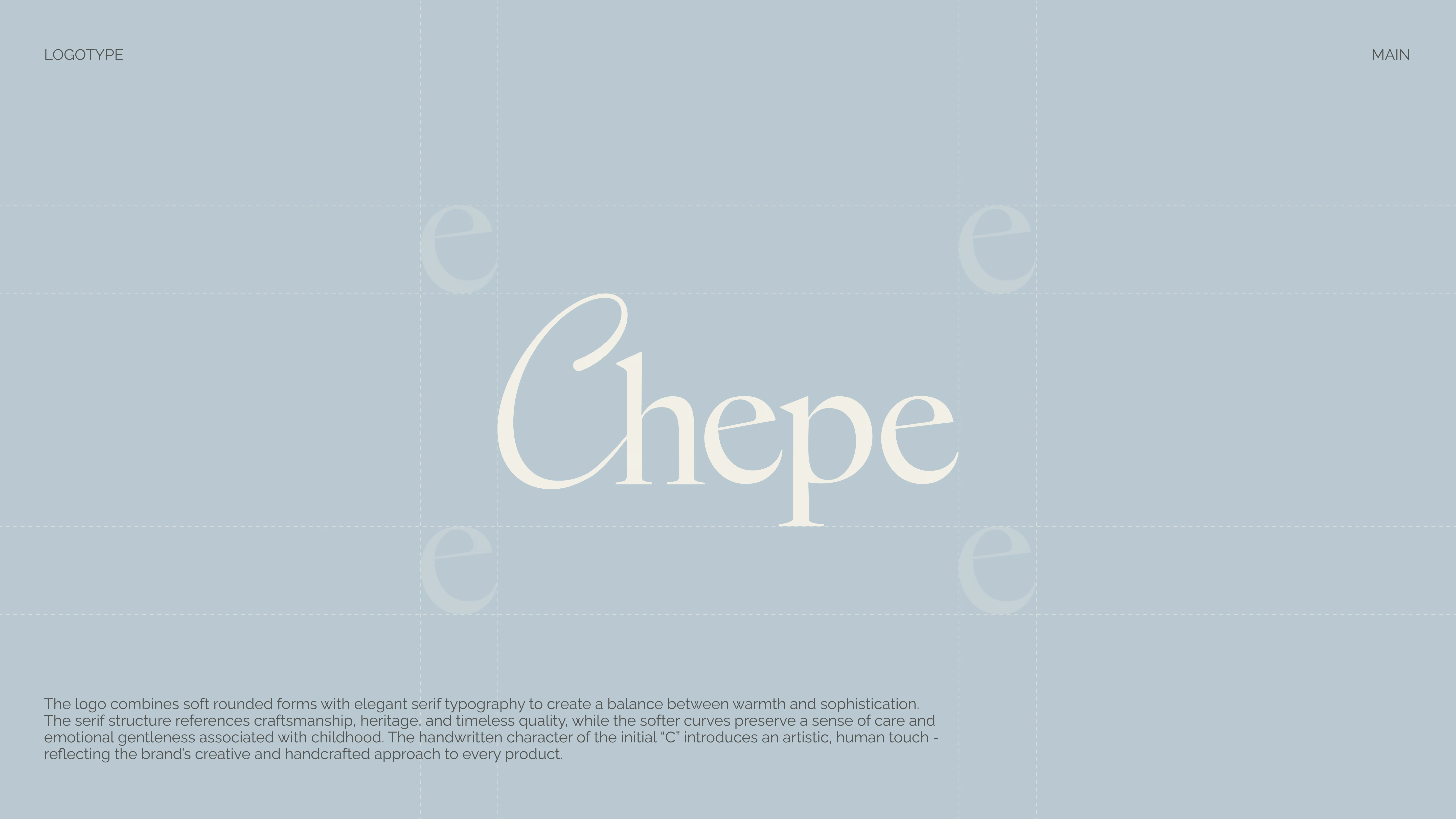
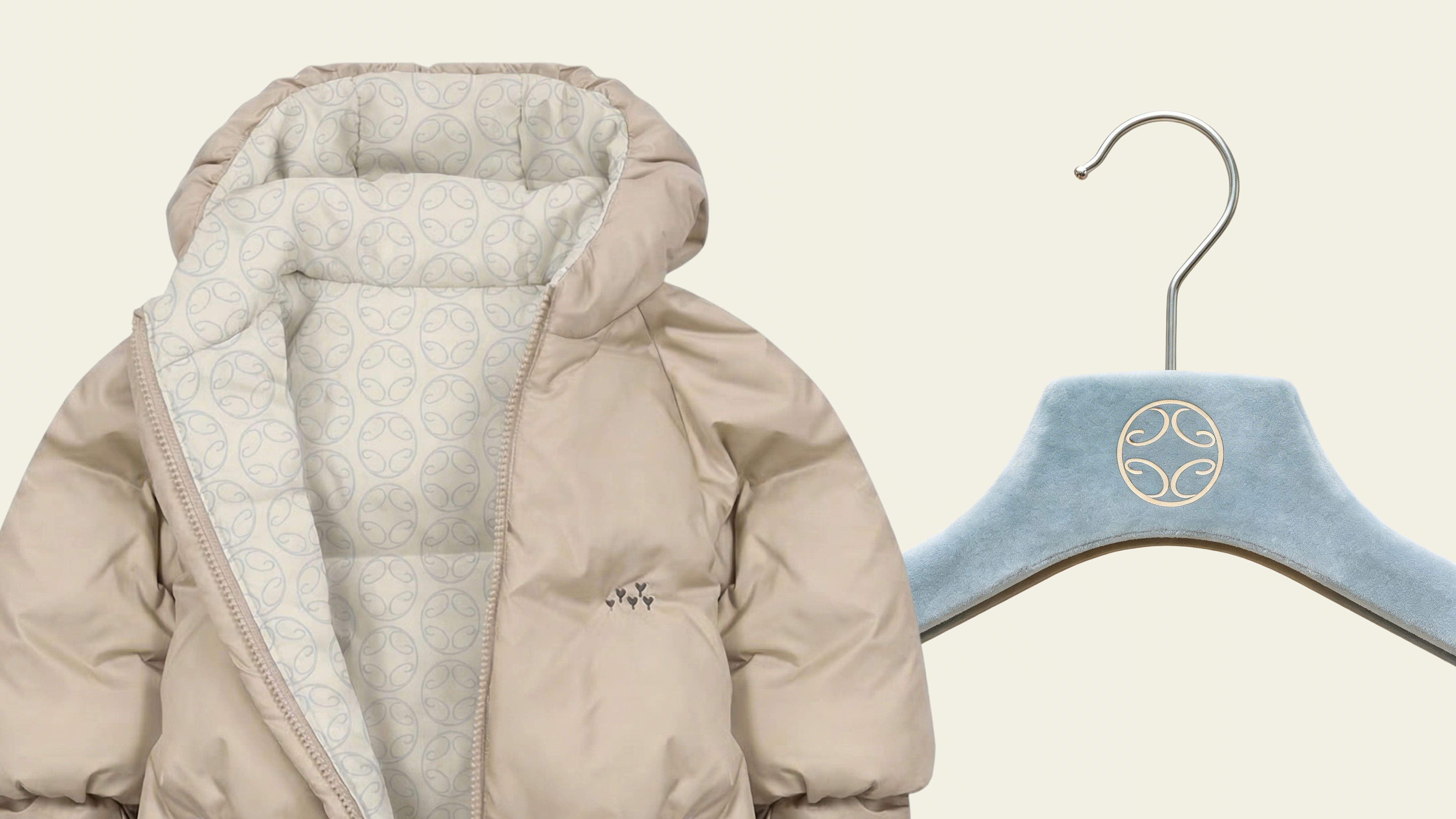
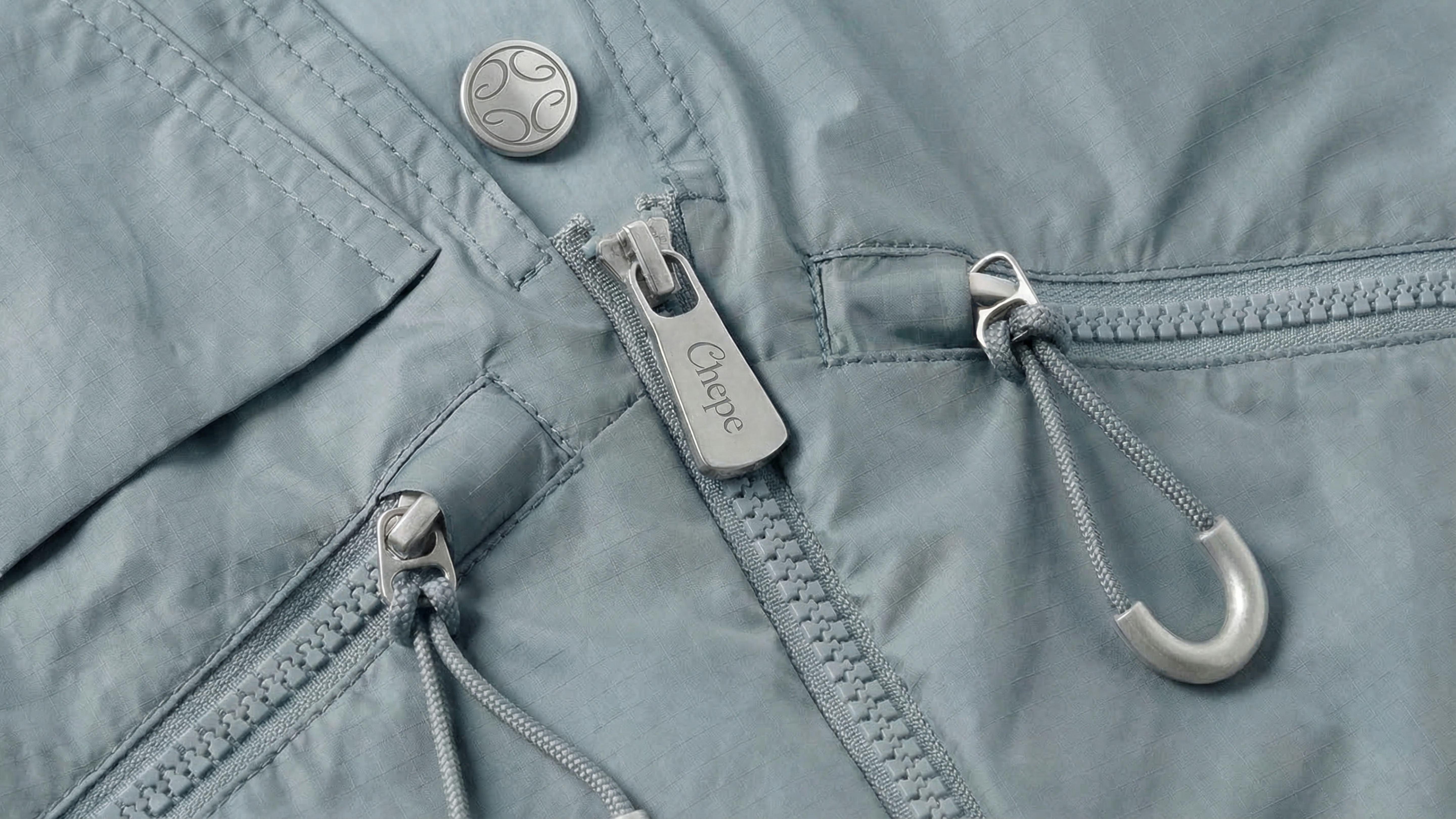
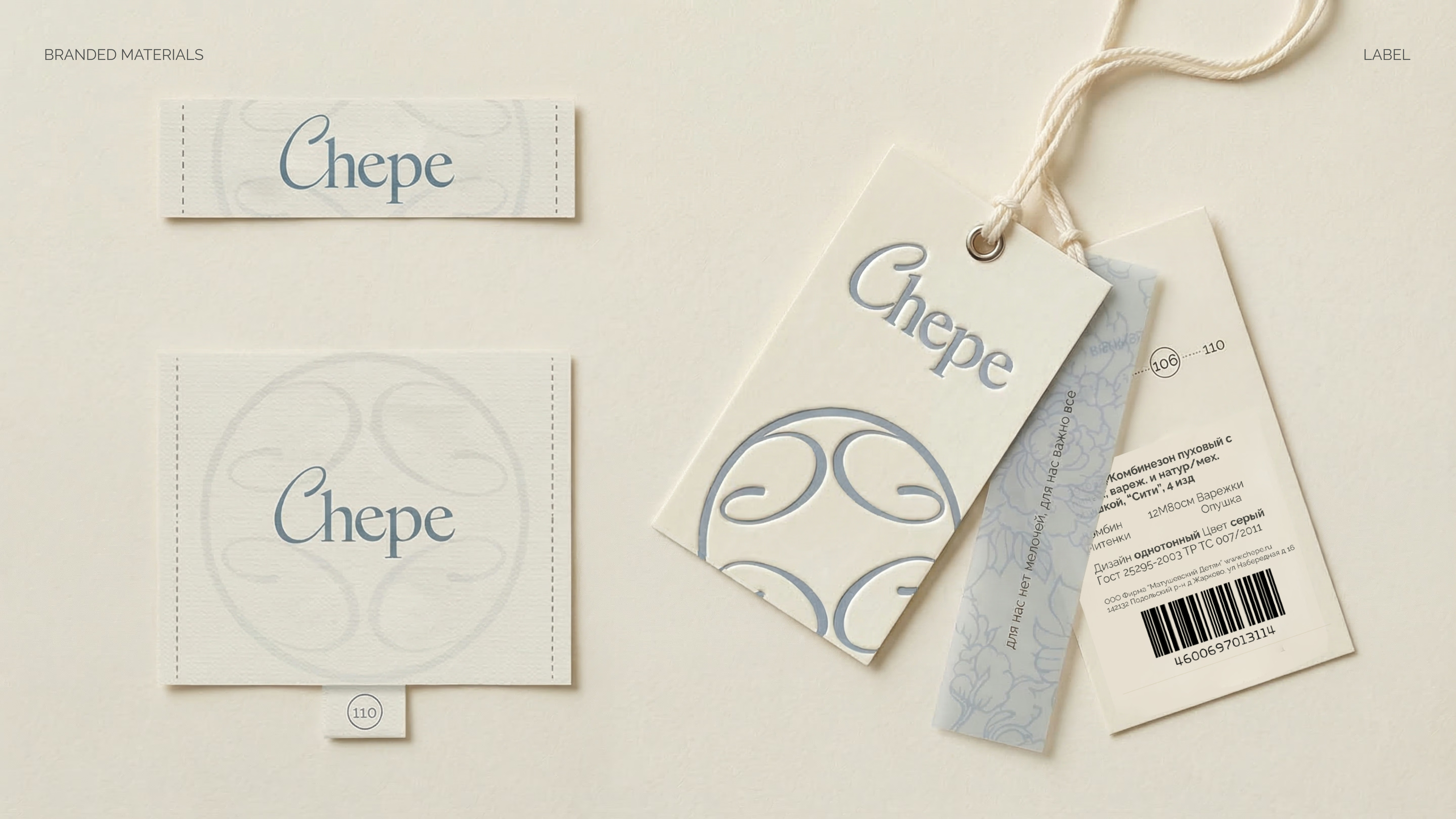
The logo combines soft rounded forms with elegant serif typography to create a balance between warmth and sophistication. The serif structure references craftsmanship, heritage, and timeless quality, while softer curves preserve care and emotional gentleness.
The handwritten character of the initial 'C' introduces an artistic, human touch - reflecting the brand's creative and handcrafted approach.
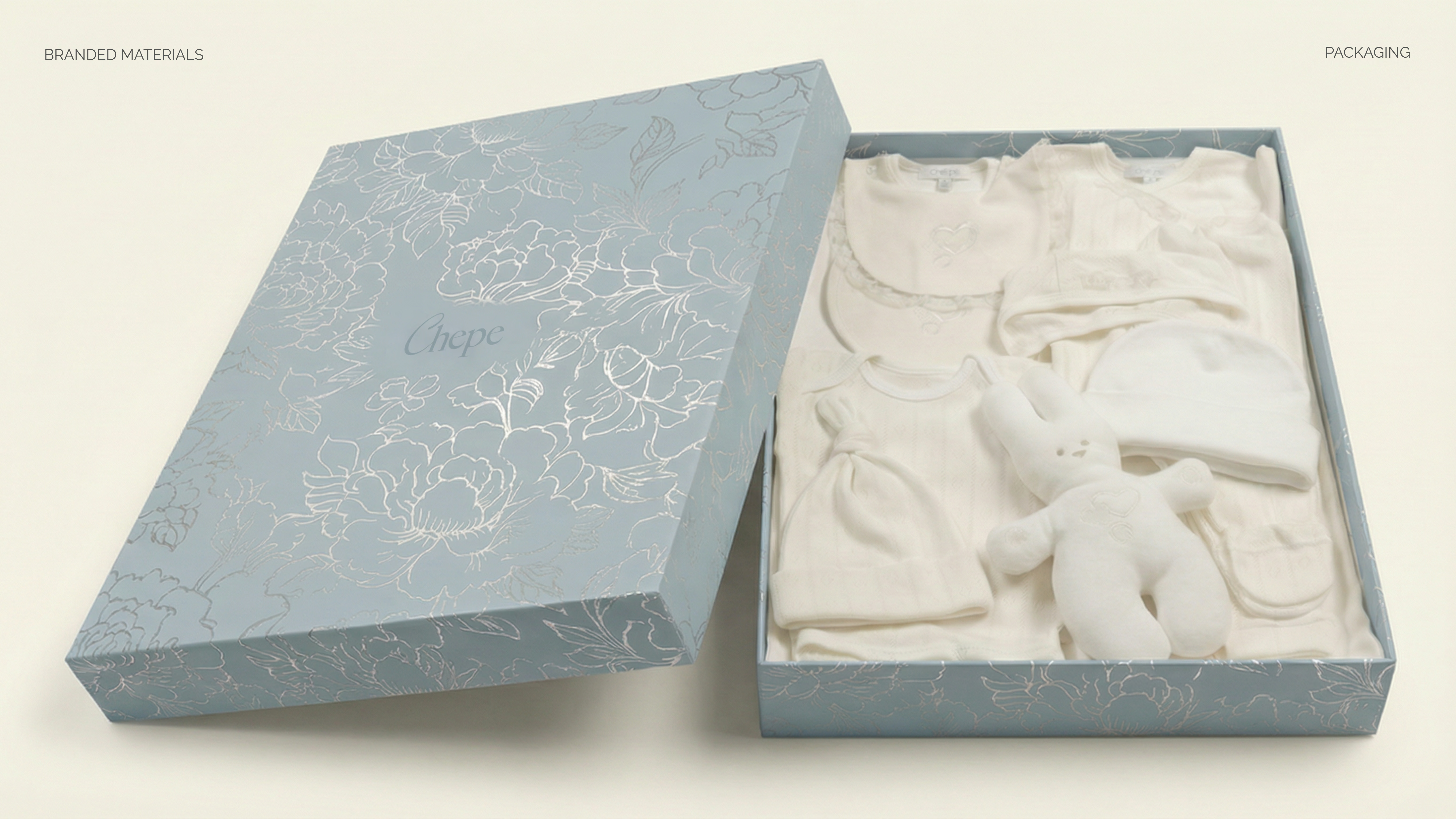
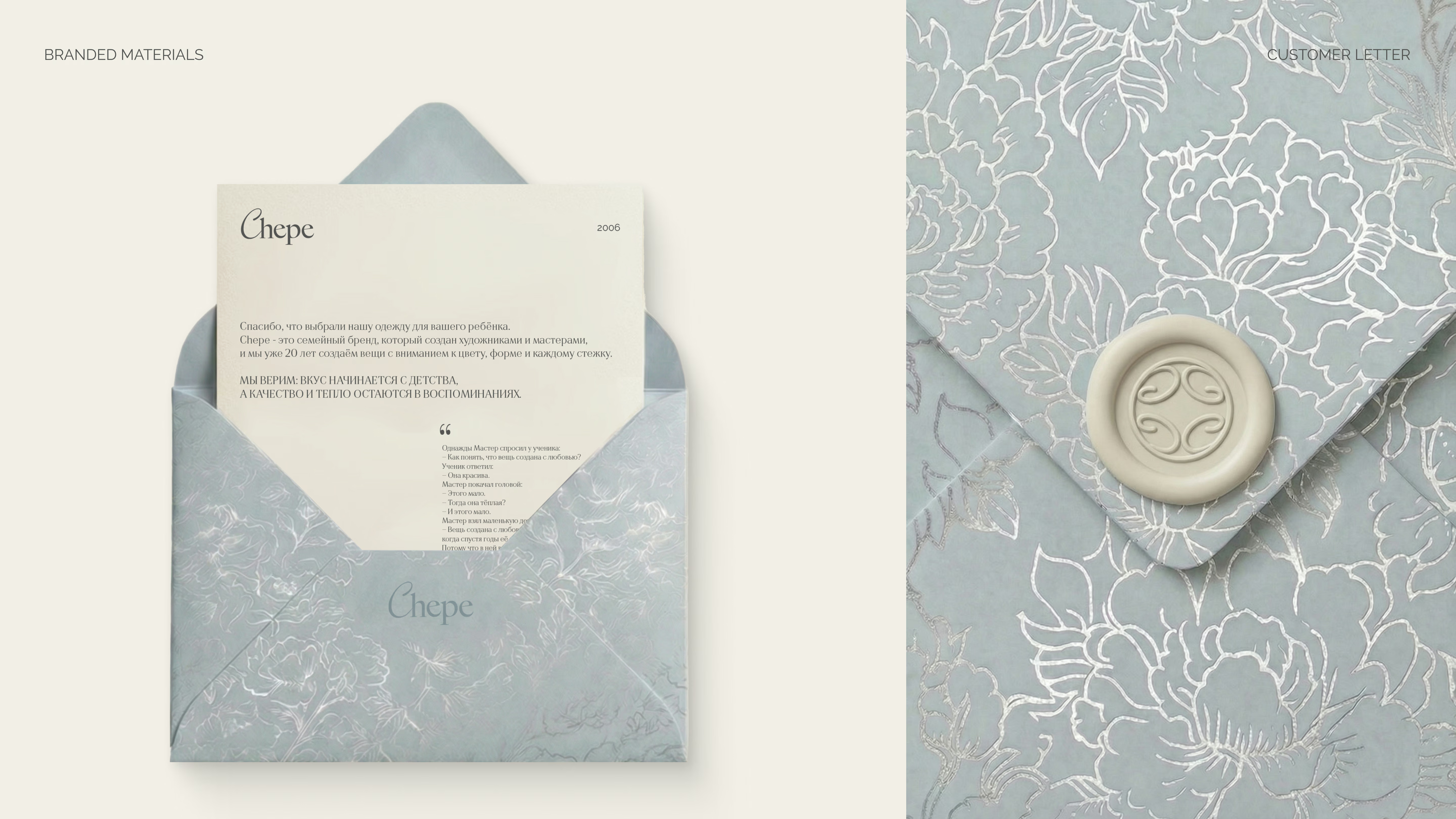
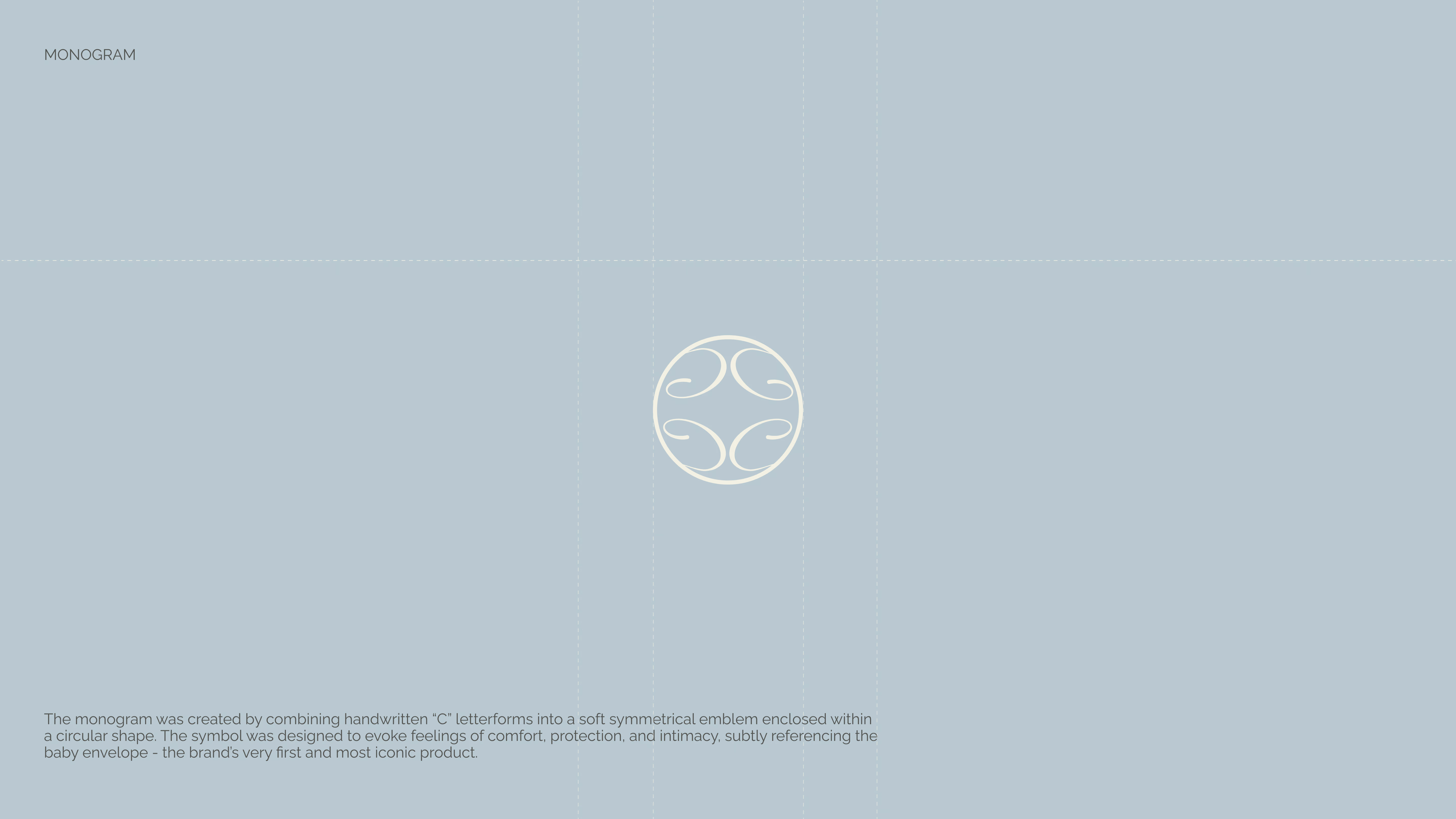
The monogram was created by combining handwritten "C" letterforms into a soft symmetrical emblem enclosed within a circular shape - designed to evoke feelings of comfort, protection, and intimacy, subtly referencing the baby envelope: the brand's very first and most iconic product.
"Children's aesthetics should not be underestimated. From the very first years of life, colour, texture, and visual environment shape a child's perception of beauty and artistic sensitivity."
— Chepe Brand Philosophy