Brand Identity · French-Inspired Skincare
Brand Identity · French-Inspired Skincare
Evora is French-inspired skincare for timeless confidence. Created for women 50+, Evora redefines skincare as a moment of indulgence - where care becomes a ritual, and beauty becomes a feeling.
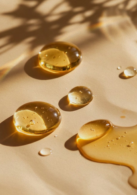
Designed for a discerning audience, the brand goes beyond functionality to deliver emotional value: confidence, ease, and the freedom to simply be. At the heart is its hero product - 100% natural botanical oil, crafted to deeply nourish, restore, and illuminate mature skin.
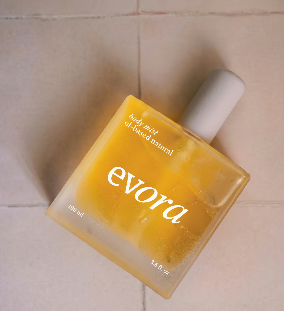
The logotype is built on a deliberate contrast between structure and softness. The first part features clean, straight letterforms - precise and firm, symbolising visible concerns of the skin: lines, dryness, and loss of elasticity.
It then transitions into a softer, italicised expression, introducing movement, fluidity, and ease. This shift visually mirrors the product's effect: transforming tension into smoothness, rigidity into suppleness. The logo becomes a metaphor for the skincare journey itself.
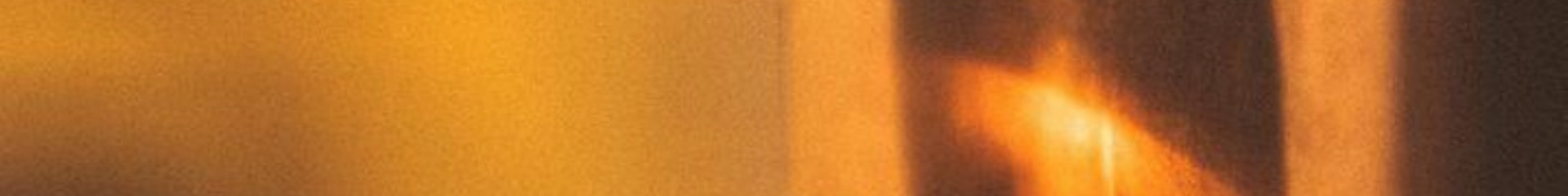
The visual language introduces botanical elements in a subtle, refined way through silhouettes rather than direct representation. Soft, diffused lighting casts delicate botanical silhouettes across the product and background, creating a sense of depth, calm, and quiet luxury.
The use of shadow as a medium adds a cinematic, almost tactile quality - reminiscent of warm, late-afternoon light, elevating the overall perception of the brand.

"Botanicals body oil with 100% natural ingredients. Care that becomes confidence."
— Evora Brand Tagline